Lithography
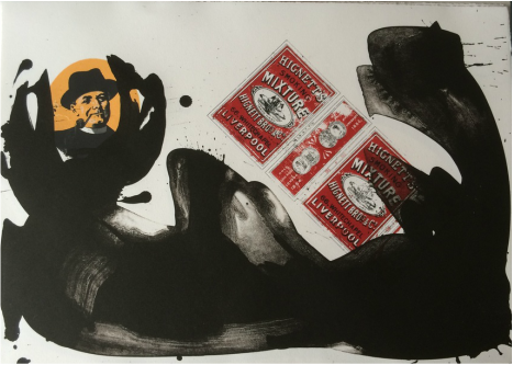
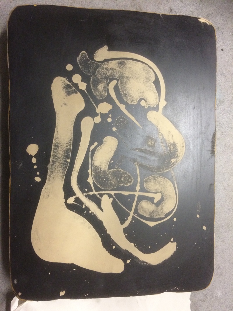
Homage to Robert Motherwell
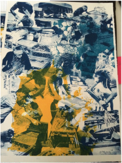
As part of the Bristol Set In Print project that I printed all the lithographic stones for, I decided to select a couple of the labels and pay homage to some of the Robert Motherwell that I love. This is a seven run print with six colours, printed from six lithographic photo plates and one stone.
|
|
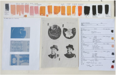
Homage to Ken Tyler
This print was created for a student exchange exhibition between current students at UWE (UK) and MICA (USA). The brief was to respond to a quote by Bruce Sterling 'Looking through the eyes of machines as humans' or 'Eruptions of the digital into the physical'
I chose, 'Looking through the eyes of machines as humans'. When someone says machine I think press, and the boundary between the printer and the press can become blurred whilst printing especially when an edition is being made. The printer becomes just as automated as the press and runs just like a machine, and the machine is just as sensitive and temperamental as any printer. Ken Tyler often designed and re modelled his presses so an artist could work without limitations and I tried to showcase that in this print, without one you can't have the other. I also wanted to create a sense of repetition through the photographic reference of the printers roller, this is the extension of the printers hand and through its rhythm turns us all into machines.
I chose, 'Looking through the eyes of machines as humans'. When someone says machine I think press, and the boundary between the printer and the press can become blurred whilst printing especially when an edition is being made. The printer becomes just as automated as the press and runs just like a machine, and the machine is just as sensitive and temperamental as any printer. Ken Tyler often designed and re modelled his presses so an artist could work without limitations and I tried to showcase that in this print, without one you can't have the other. I also wanted to create a sense of repetition through the photographic reference of the printers roller, this is the extension of the printers hand and through its rhythm turns us all into machines.
|
|
|
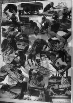
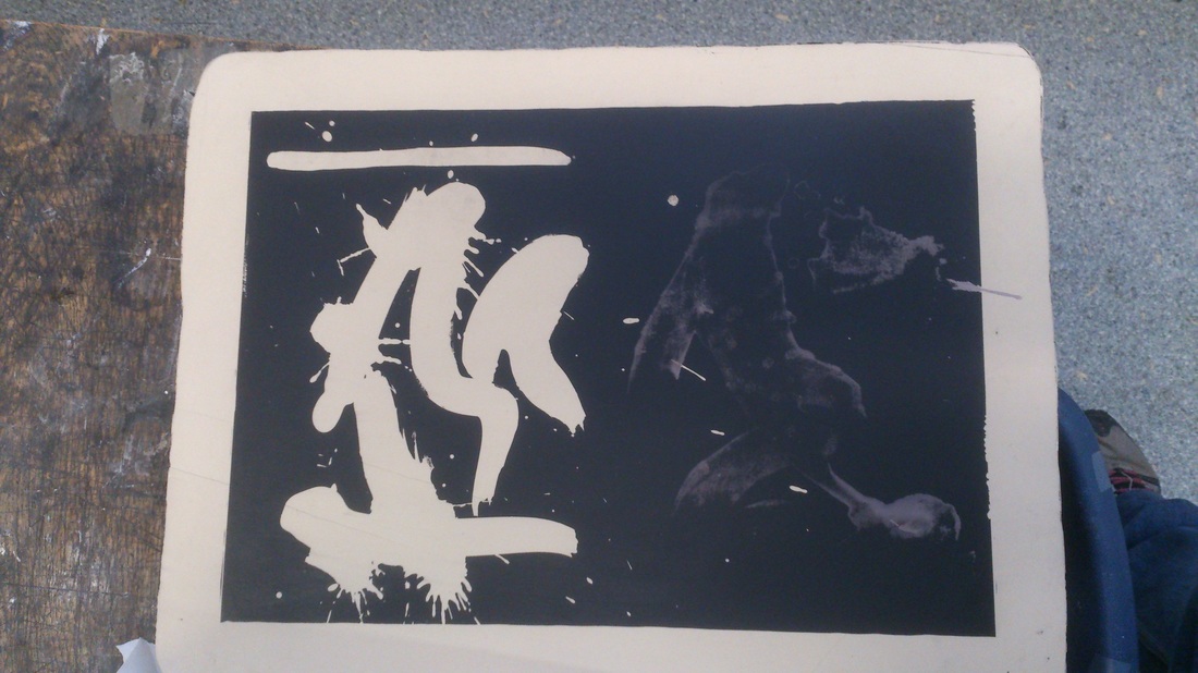
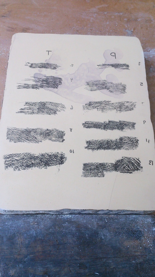
Negative Washes
|
|
Exploring different way of creating negative washes on stone.
Top left: First test- Gum Arabic (stark white mark) and water colour pigment. Bottom Left: Second test- Watercolour pencils and paints. Right: Third test- Shellac method of Transposition. I had been inspired to carry out these tests after seeing a negative wash print by Robert Motherwell. I have also tried Lo-shu washes in the past but wanted to explore other alternatives. |
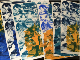
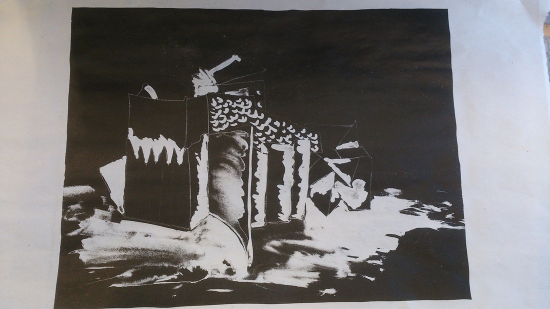
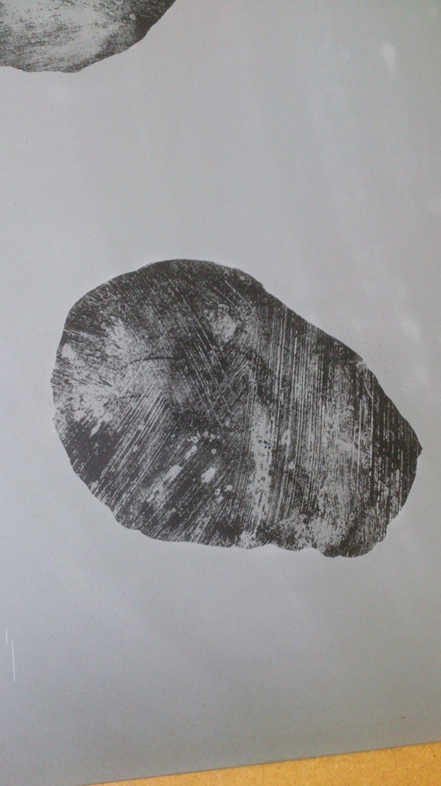
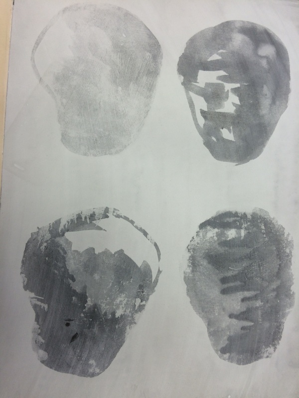
Transfer methods
I have been making and using my own transfer paper for a number of years experimenting with a range of paper from thin cartridge (best choice) to opened out matchboxes (see Artist Books page; If James Castle Made Lithographs). However after seeing a selection of life drawings on primed paper I started thinking about the possibility of a textured transfer paper that could capture brushstroke marks. I have experimented with thickening the gum arabic which I have tried to achieve using powdered gum, talc and plaster. The powdered gum didn't work at all but I did get some results from the other two. The plaster however does start to set so you have to be quick when working with it.
Crayon work seems to work well but I am still struggling with the solvent washes. There also seems to be a use by date on the textured transfer paper so more test and research needs to be carried out.
Crayon work seems to work well but I am still struggling with the solvent washes. There also seems to be a use by date on the textured transfer paper so more test and research needs to be carried out.
|
|
|
